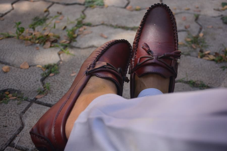
Color coordination is vital in design and aesthetics, impacting our visual experiences in numerous contexts. When it comes to maroon, a deep and rich reddish-brown color, finding complementary colors becomes essential in creating harmonious and visually pleasing combinations. Whether you’re selecting colors for fashion, interior decor, or graphic design, understanding what colors go well with maroon can help you achieve striking and sophisticated results. In this article, we will explore various color schemes and combinations that beautifully complement maroon, offering practical tips and inspiration for incorporating this captivating hue into your creative endeavors.
What Colors Go With Maroon?
Maroon, a deep and rich reddish-brown color, pairs exceptionally well with several complementary hues. To create an elegant and visually appealing combination, consider incorporating colors like gold, cream, or beige. These neutral tones provide a sophisticated contrast to maroon. Additionally, deep greens, such as forest green or olive, can beautifully complement maroon, creating a rich and earthy palette. For a bolder look, try combining maroon with shades of mustard yellow or burnt orange, adding warmth and vibrancy to your color scheme. Ultimately, the key is to experiment and find the right balance that resonates with your style and the desired aesthetic.
The Color Wheel And Color Harmony
A color wheel is a fundamental tool for understanding color relationships and achieving color harmony in design. It consists of a circular arrangement of colors, typically divided into primary, secondary, and tertiary colors. Color harmony refers to the pleasing combination of colors that work well together.
The primary colors on the color wheel are red, blue, and yellow. These colors cannot be created by mixing other colors and are used as the foundation for all other colors. When primary colors are mixed, they produce secondary colors. For example, combining red and blue creates purple, red and yellow create orange, and blue and yellow create green.
Tertiary colors are created by mixing a primary color with a neighboring secondary color on the color wheel. This results in colors like red-orange, blue-green, and yellow-green. Tertiary colors offer more nuanced options for achieving color harmony.
Color harmony can be achieved using various color schemes based on the color wheel. Some typical schemes include:
- Complementary Colors: These colors are directly opposite on the color wheel. For example, the complementary color of red is green. Combining complementary colors creates a high-contrast and vibrant effect.
- Analogous Colors: Analogous colors are located next to each other on the color wheel. They share similar undertones and create a harmonious and cohesive look. For instance, red, orange, and yellow are analogous colors.
- Triadic Colors: Triadic color schemes involve three colors evenly spaced on the color wheel, forming a triangle. This creates a balanced and vibrant combination. An example would be combining red, blue, and yellow.
- Monochromatic Colors: Monochromatic schemes involve different shades, tints, and tones of a single color. It creates a harmonious and visually soothing effect by exploring the variations within one color family.
Complementary Colors For Maroon
Complementary colors are hues positioned directly opposite each other on the color wheel. Maroon, its complementary color, is a shade of green. When combined, maroon and green create a striking visual contrast that can be vibrant and harmonious. Here are some options for complementary colors to pair with maroon:
Forest Green: This deep, rich green color complements maroon beautifully. It creates a sophisticated and earthy color combination, ideal for creating balance and depth.
Olive Green: With its warm undertones, olive green provides an exciting contrast to maroon. This combination offers a unique and contemporary aesthetic, particularly suitable for fashion and interior design.
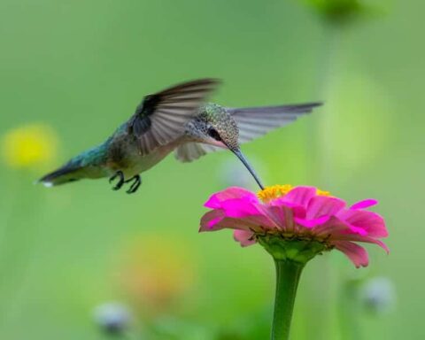
Emerald Green: For a bold and vibrant look, consider pairing maroon with emerald green. This combination creates a luxurious and energetic visual impact, making it an excellent choice for accent pieces or statement designs.
Mint Green: If you want to create a softer and more refreshing color palette, mint green can be a delightful choice. When combined with maroon, it adds a touch of lightness and brightness to the overall composition.
Analogous Colors For Maroon
Analogous colors are hues adjacent to each other on the color wheel, creating a harmonious and cohesive color scheme. Regarding maroon, several analogous colors can complement and enhance its rich tones.
Here are some options for analogous colors to pair with maroon:
Deep Red:
As maroon is a deep and dark shade of red, combining it with slightly lighter or brighter reds can create a captivating and monochromatic effect. Deep reds like burgundy or wine red work particularly well in adding depth and richness to the overall color scheme.
Purple:
Positioned next to maroon on the color wheel, purple hues offer a natural and elegant choice for creating an analogous color combination. Shades such as plum, eggplant, or aubergine can add a touch of sophistication and regality to the design.
Brown:
Since maroon already has brown undertones, incorporating various shades of brown can create a warm and cohesive palette. Lighter browns like caramel or chestnut can add contrast, while darker browns like chocolate or mahogany can provide depth and richness.
Pink:
While maroon is a deeper shade of red, incorporating lighter and softer pinks can create a delicate and feminine contrast. Blush pink or dusty rose can offer a subtle and romantic touch to the overall color scheme.
Triadic Color Schemes With Maroon
Triadic color schemes involve selecting three colors evenly spaced from each other on the color wheel, forming a triangle. These combinations create a vibrant and balanced palette that can add visual interest to your design. When it comes to maroon, there are several triadic color schemes to consider:
Maroon, Yellow-Green, and Blue-Green pairing maroon with shades of green create a dynamic and refreshing color combination. The deep and rich maroon is the anchor color, while the yellow-green and blue-green hues provide contrast and vibrancy. This triadic scheme adds energy and a natural feel to your designs.
Maroon, Yellow, and Blue combining maroon with yellow and blue creates a bold and vibrant triadic color scheme. Maroon is the intense base, while yellow and blue add brightness and excitement. This combination is excellent for creating a striking and eye-catching design with warm and cool tones.
Maroon, Orange, and Green for a warm and earthy triadic color scheme. Pair maroon with shades of orange and green. Maroon provides depth and richness, while orange adds warmth and energy. Green complements both colors, offering a fresh and natural element. This combination works well for nature-inspired themes or designs that evoke a cozy and inviting atmosphere.
Final Words
In conclusion, exploring different colors that go well with maroon can open up a world of creative possibilities. Whether you opt for complementary colors to create striking contrasts, analogous colors for a harmonious and cohesive look, or triadic color schemes to add vibrancy and balance, the key is to experiment and trust your artistic instincts. Remember, the color wheel and principles of color harmony are excellent guides, but be bold and bold and explore unconventional combinations. Each color has unique characteristics and can evoke different emotions and moods when paired with maroon.
FAQ’s
Q: What is the symbolism of the color maroon?
A: Maroon is often associated with luxury, power, and sophistication. It can evoke a sense of elegance, wealth, and high status. Additionally, maroon can symbolize stability, strength, and determination.
Q: Can maroon be used as a neutral color?
A: While maroon is rich and bold, it can also be used as a neutral in specific contexts. When paired with complementary or analogous colors, maroon can serve as a grounding and versatile element in a color scheme. It can add depth and warmth to a neutral palette, making it suitable for bold and understated designs.
Q: What are some typical applications of maroon in design?
A: Maroon is commonly used in various design fields, including fashion, interior decor, graphic design, and branding. In fashion, maroon is famous for creating luxurious and sophisticated looks. In interior decor, maroon can be used as an accent color to add richness and depth to a space. In graphic design and branding, maroon is often employed to convey elegance, professionalism, and a sense of tradition.

